The Business of Fashion
Agenda-setting intelligence, analysis and advice for the global fashion community.
Agenda-setting intelligence, analysis and advice for the global fashion community.

PARIS, France —Before every Dries Van Noten show, a digital crib sheet is distributed to press, listing all the ingredients that give the new collection its own particular flavor: inspirations, fabrications, names and places. When the latest arrived, it was a bit skimpier than usual, light on most things except the colour palette, where dozens of shades were listed. Among the more arcane were petrol, zabaglione, mayonnaise, mouse, marine, putty, lettuce, truffle, bark, dragoon blue and amber sand.
Guests arrived at a garage in the Third Arrondissement, were funneled through a doorway and directed up a concrete spiral through eight floors of carpark which, somewhere along the way, evolved into the offices of French newspaper Libération. Just under the roof was Van Noten’s showspace. Arcane again.
There have been many times when that off-kilter tone was maintained throughout the subsequent show. Not here. The digital teaser’s emphasis on colour actually pointed to the spine of the collection, which was a convincing statement about the seductive power of tonal blending. The clothes were real, often quite ordinary. “True garments,” Van Noten called them. “Very simple shapes, coats, jackets, shorts, pants, nothing unexpected.” What he wanted to explore was how far he could push colour for men. And that’s why he resisted the suggestion that his collection might be another example of this season's fascination with “normality”. “The flavor, the nuance, the combinations are too strange,” he insisted.
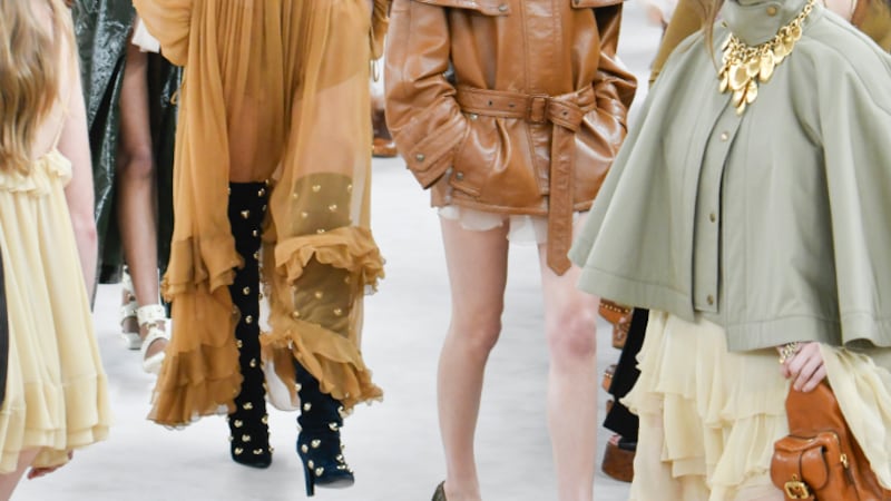
And yet the strangeness was peculiarly alluring. An ice-blue jacket matched to a khaki top and brown trousers? An olive green sweater over blush pink shorts? Who knew? It was easier when the show turned to prints, ferns and florals, decorated with beading and embroidery, counterpointed by classic checks, plaids and paisleys. This was classic Dries country. "It's not a theoretical collection," he said. "It had to make sense." And it did, as an optimistic statement about desirable, wearable menswear in a city which also has good reason to be cheerful right now with its new president. Libération indeed.
And designer Sabato De Sarno doubles down with his Cruise ‘25 show for the brand, writes Tim Blanks.
From where aspirational customers are spending to Kering’s challenges and Richemont’s fashion revival, BoF’s editor-in-chief shares key takeaways from conversations with industry insiders in London, Milan and Paris.
BoF editor-at-large Tim Blanks and Imran Amed, BoF founder and editor-in-chief, look back at the key moments of fashion month, from Seán McGirr’s debut at Alexander McQueen to Chemena Kamali’s first collection for Chloé.
Anthony Vaccarello staged a surprise show to launch a collection of gorgeously languid men’s tailoring, writes Tim Blanks.