The Business of Fashion
Agenda-setting intelligence, analysis and advice for the global fashion community.
Agenda-setting intelligence, analysis and advice for the global fashion community.
“The shoes are normally the place we begin each season.”
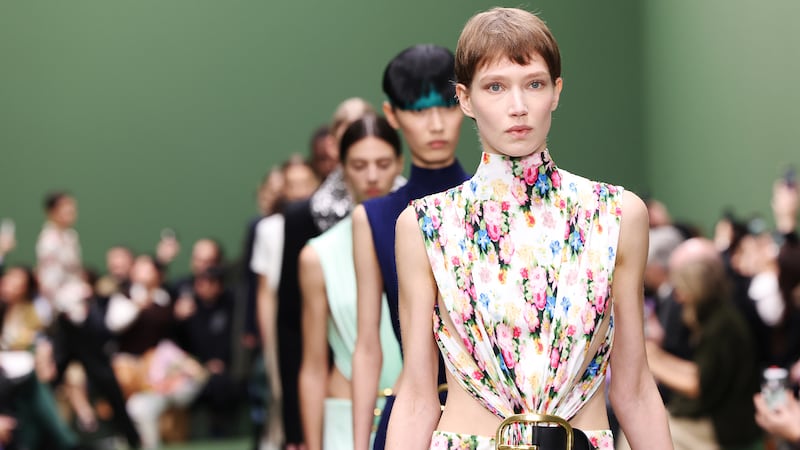
Daniel Lee and I are previewing Burberry’s new collection for Spring/Summer 2024, and I’m as happy as he is to start with shoes, because the whole world surely knows by now that a major part of his brief at Burberry is to develop the accessories offering at Britain’s biggest fashion brand. He’s raring to go.
“I think we’ve moved on from the period in fashion where it was led by, say, a silhouette or an aesthetic or a stylistic sense of putting things together,” Lee declares. “What people respond to is a singular object. My role is really to distill the essence of the brand into that object, and I find often with accessories, you can do that in a stronger way.”
The singular object — usually a bag or a shoe, occasionally a belt, a coat, a jacket, maybe a pair of jeans — can power a business. It crystallizes the desire that fuels fashion. It’s a perfect fetish object. “I think so,” Lee agrees, “because it’s all from obsession, particularly with a shoe, even more than a bag. You obsess over every detail, and the harmony of how things come together.”
ADVERTISEMENT
He claims there’s no real inspiration from the past for Burberry’s footwear. There wasn’t really an archive. “So in the new collection it’s been about distilling the idea of Burberry as a brand that’s known for the outdoors. It’s synonymous with the weather and protection. Taking that spirit into the shoe meant making heels that are not too delicate, things that are easy to walk in outside, things that feel a little bit chunkier, a little bit more protective, not too precious; leathers that are meant to look like they could withstand time and the elements.”
But there are also platform sandals that look like something dressy dames might have worn at house parties in the 1920s and 30s. “There’s a bit of that going on,” Lee concedes. “The hedonism of the Bright Young Things. It’s just a sense of enjoyment. And I want the work that we do to feel joyful, to feel warm, to make people feel good.”
The Bright Young Things were a small group of aristocratic boho Brits and rich kids who scandalised society with their outlandish antics in country houses and stately homes while the world was going to hell with the Great Depression and surging Fascism. Sound familiar? Lee agrees hedonism then and now is an antidote to hard times. “And if we’re talking about the notion of Britishness, that can be seen in a very negative way after Brexit, but what we’re leaning into is the positivity of creativity, and the breadth of British culture. That’s the duty, the responsibility we have here, to bring a bit of positivity back in the darkest times.”
When Christopher Bailey helmed the creative side of Burberry during the early decades of this century, the brand’s essential Britishness was its selling point. “It was the thing that people fell in love with,” says Lee. “I think there’s definitely a return to that. The brand has a responsibility to preserve craftsmanship, to use fabrics made in the UK. In Christopher’s time, there was a lot of innovation in the [company’s] mill in Yorkshire. Then in more recent years, it was more of the core carry-over offer of trench coats. They were in the store, but not really in the image or the show. So it’s been nice to engage with the people in Yorkshire again to make pieces for the show and to develop fabrics.”
What excites Lee most for Spring/Summer 2024 is an effect he found in an archive trench. The way two fibres were woven together gave fabric a shine, a glow almost. The technical term is changeant, also known as tonic. “We thought, ‘That’s really beautiful, let’s try it on everything’, and it worked,” says Lee. So there’s a tonic sheen on cotton outerwear, on tailoring, on dresses where it adds an evening-ish edge. Night for day, which fits neatly with Lee’s hedonistic fancy.
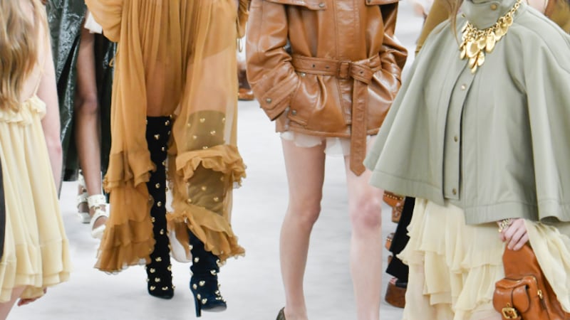
Another stand-out is a springy jersey jacquard. “When you think ‘stately home,’ you think of velvet and tapestry in this kind of texture, so that is something that we wanted to bring into the collection.” It’s especially vivid in a floral print adapted from a painting done by a fellow student of Lee’s at Saint Martins. It would be quite proper, except the colours are loud and the print is warped, as though it’s been rained on. “English weather,” Lee half-jokes. He loves a cliché, almost as much as an ironic twist. There’s one of those with the red-and-blue “TfL check,” the kind you’d once find covering seats on Transport for London’s buses or tube trains. It reminds me a little of Miuccia Prada’s “ugly chic” fabrics, fashion irony at its finest. And wouldn’t Burberry love a little of that action?
Burberry is one of the world’s great legacy brands. Lee is acutely aware of the implications. “Obviously, it’s a huge financial responsibility. And everybody already has an enduring opinion of Burberry, so it’s not the same as bringing a brand from obscurity into the popular realm. But it’s maybe not necessarily known for the things that we want it to be known for.” So what does that mean for the future?
“The brand’s legacy is ultimately the outdoors,” he reiterates. “That’s the thing we have in mind when we work on everything. It’s in the way we approach our choice of material, the way we detail the clothing and the accessories. Functionality is applied across the board, whether it’s a chiffon gown or a shoe. It’s how we tie everything together.” The same idea was evident in Lee’s interpretation of Bottega Veneta, his previous grab at the golden apple. Even the dressiest pieces had a functional edge. It created a striking tension. “I think it’s a way to bring a contemporary edge, and maybe it’s just something that I’m interested in. I think the best work is always when the creative director’s interests are also the brand’s.”
ADVERTISEMENT
Lee was something of an iconoclast at Bottega Veneta, which suggests a brand as weighted with iconography as Burberry would be catnip to his contrariness. “I definitely think I’m someone who questions everything but at the same time, I find the iconography here inspiring because it’s somewhere to begin. It’s a step by step process. It takes a minute. Especially with a brand as big as this.”
That sounds like Lee is managing expectations. Still, he points to new directions in the spring collection. “We’re going hard into the trench coat, which is an obvious choice, but at the same time we’re trying to create new feelings of heritage, new symbols of the brand. There’s definitely an exploration of the more feminine side through the whole thing, because Burberry has traditionally always had a masculine association. But I don’t think it’s necessarily feminine or masculine. There’s more fluidity. It’s about a more languid cut, more precious fabrics, like silk and viscose. More skin in the menswear, bare arms, décolleté.”
The new trench is belted low, cut slimmer, sharper, in gabardine at the opening of the show and duchesse satin at the close. The iconic check lining has been replaced by a print derived from abstracted elements of the armour worn by Burberry’s logo, the galloping knight (in brand parlance, the EKD, Equestrian Knight Design, the winning entry in a public competition mounted by Thomas Burberry over 120 years ago). In fact, there’s a lot of black, white and beige in the collection but there isn’t much check, which is a bold move given how integral it is to the brand image.
Lee admits that young customers in particular seem drawn to the check as a tribal signifier. I’m thinking here of Billie Eilish in her various head-to-toe Burberry looks, checked to the tip of her fingernails. Does he want to agitate people? “I do. I want to take risks. If it’s expected, it’s not necessarily the most exciting. And if the most exciting work is not really understood or appreciated at the beginning, the crowd-pleasing work doesn’t necessarily have the longest lifetime.”
Maybe the EKD (Lee flinches at the term) is also a risk. He claims the introduction of hardware has been a big project since he arrived at Burberry. “And a lot of it started with taking elements from the knight and twisting them into hardware that we can use on jewellery, bags, shoes, as well as prints.” A metal mesh saddle bag features a clip like a carabiner shaped after the armour on the horse’s head. “For me, the use of metal, the zips, the hardware always give an element of punk, this kind of London DIY edge. The idea that you could just put a zip through a dress that would otherwise be typically bourgeois and you’ve twisted it. We’ve used eyelets on dress hems here and I think that looks kind of twisted. That’s how I feel we can own the dresses and bring them into our world.”
There’s a lot of twisting there, which reminds me that, brand logo though it may be, I find the knight so odd it’s practically perverse. “I think that’s because our relationship with a knight now is either people getting killed by a sword in a film, or you see it in a museum,” says Lee. “There’s a really amazing museum called the Royal Armouries near where I grew up in Yorkshire. I would go there as a kid and I was fascinated. More than any of the other symbols of the brand, the knight’s the one that I feel most compelled by. There’s this feeling of nostalgia I have.” He believes he’s not alone in such a sensation. “Everyone has a nostalgic relationship with Burberry in some way. There’s some story, some memory…” I see echoes of BDSM in the prints of the knight hardware. I guess that could trigger a certain kind of nostalgia in some people.
Another risk is the Burberry blue, currently — and controversially — turning Bond Street tube station into Burberry Street in a brand collab with Transport for London. Lee discovered the shade in a version of the Burberry logo from the Eighties, and it has become as polarising a calling card as the green he slathered over Bottega Veneta. “That’s good, fashion’s usually love or hate,” Lee insists. “I’m always obsessed with this. Of course, we have to take ownership of our work, so it’s a very important part of the process. But I’ve never been someone who particularly likes to write the name across a product as an exercise in branding.”
He mentions Martin Margiela, whose use of white in his stores was more quietly potent and more appropriate for that particular brand than any distinctive logo. For Lee, the Burberry blue conveys a similar power, though in this case it’s regal majesty. The more obvious option would have been purple. “But purple didn’t exist in the history of Burberry and I wanted to do something that felt like it came from a real place. I think colour appeals to people because it’s emotion. It’s like music. And music can also appeal or repel in the same way. It’s very universal.”
At 37, Lee believes he’s part of a generational change in fashion, maybe one that is more realistic, more pragmatic. It’s that focus on a singular object again, “communicated in a way that gives it a context and captivates people’s imagination.” At Burberry, he wants people to fall back in love with the trench coat, and the tailoring too, which he proudly calls a celebration of the “idea” of Savile Row. But, for Lee himself, “The captivating product really is the accessories, because that’s the expectation on my shoulders from the brand, and also the world.”
But his celebration of tradition isn’t all that it seems.
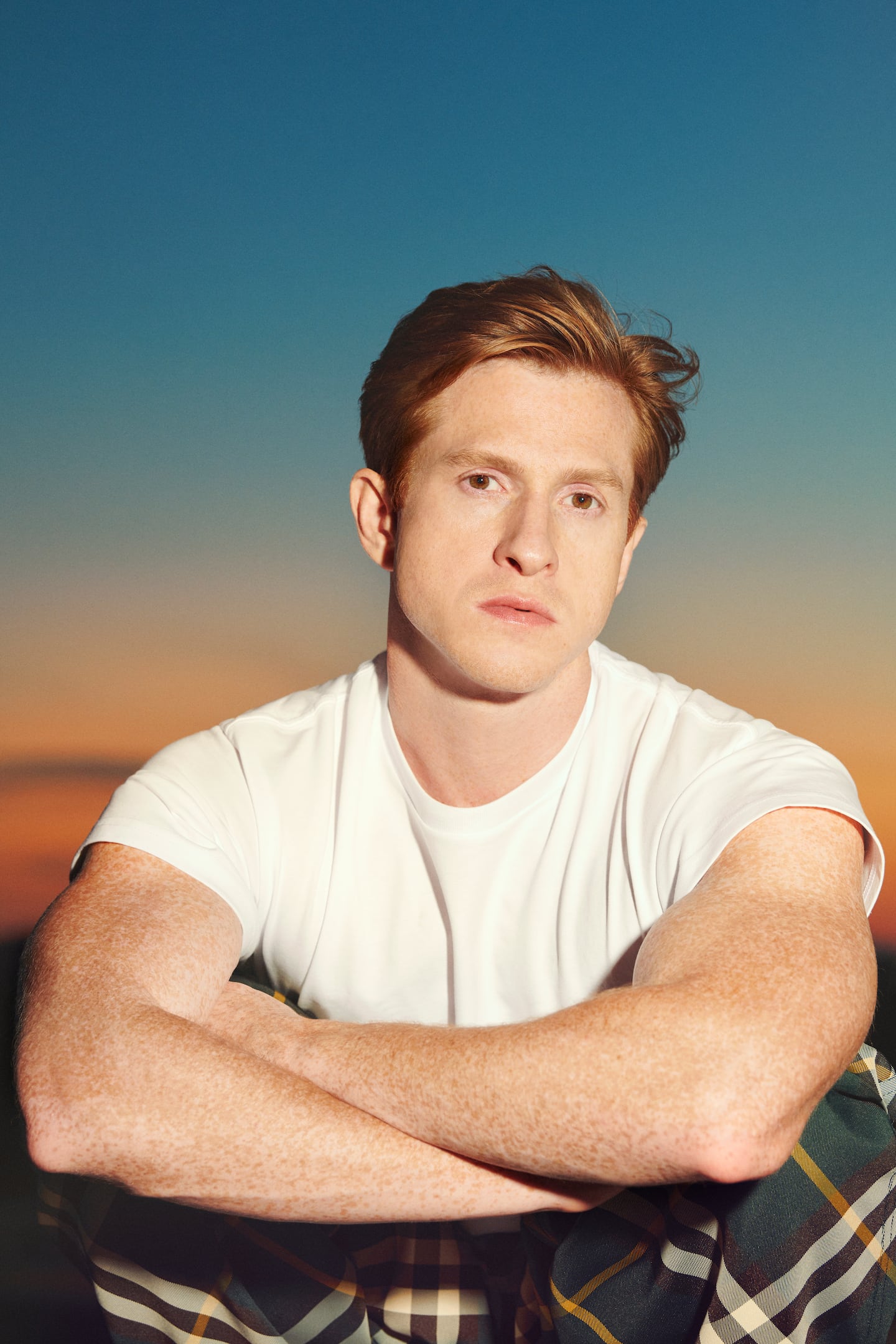
Daniel Lee has been appointed Burberry’s chief creative officer, succeeding Riccardo Tisci, as the British luxury brand seeks to accelerate growth under a new CEO.
Tim Blanks talks to the British designer about his creative strategy and why his approach has struck a chord with consumers as the Kering-owned brand returns to growth.
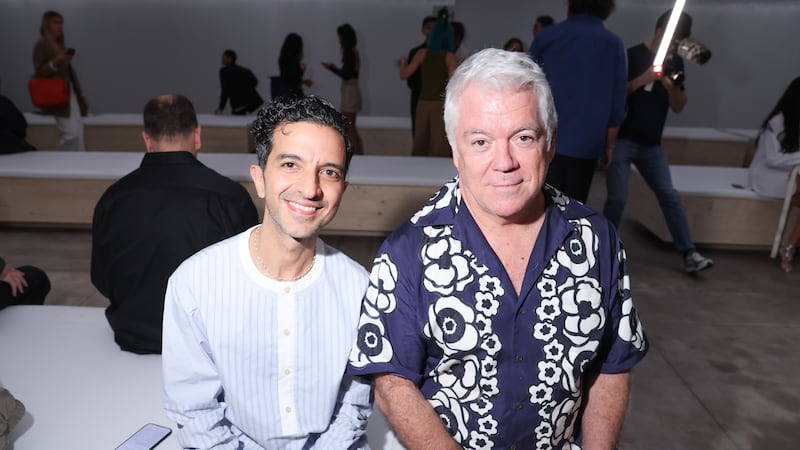
Tim Blanks is Editor-at-Large at The Business of Fashion. He is based in London and covers designers, fashion weeks and fashion’s creative class.
From where aspirational customers are spending to Kering’s challenges and Richemont’s fashion revival, BoF’s editor-in-chief shares key takeaways from conversations with industry insiders in London, Milan and Paris.
BoF editor-at-large Tim Blanks and Imran Amed, BoF founder and editor-in-chief, look back at the key moments of fashion month, from Seán McGirr’s debut at Alexander McQueen to Chemena Kamali’s first collection for Chloé.
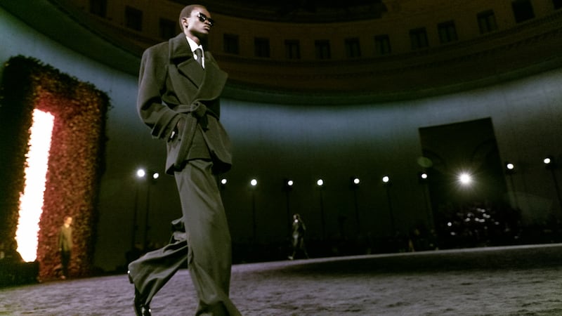
Anthony Vaccarello staged a surprise show to launch a collection of gorgeously languid men’s tailoring, writes Tim Blanks.
BoF’s editors pick the best shows of the Autumn/Winter 2024 season.